The short answer
Each good example had to have produced at least 250 qualified leads for clients who went on to fund deals from them. All three are simple — a black card with a $500,000 deposit notification, a restaurant ad over a kitchen photo, and a line-of-credit ad over a nail salon — and all three say $500K. The bad ones are the kind brokers copy: a lead-magnet ad about what lenders consider, a vague brand ad with no number or product, and a cluttered infographic nobody reads.
Example ads are usually picked because they look good. These were picked by a query. We pointed an AI assistant at our ad account and asked for creatives that had generated at least 250 leads, so that nothing on the list was a fifty-lead fluke, and each of the three that came back had produced at least 250 qualified leads for clients who went on to fund deals from them.
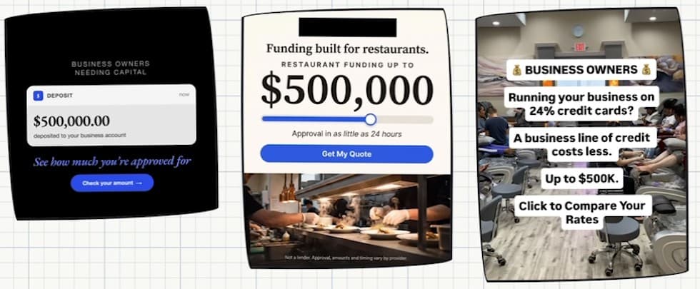
| Ad | What it says | Checks it hits |
|---|---|---|
| Black card | “Business owners needing capital”, a $500,000.00 deposit notification, “See how much you’re approved for” | One idea; the same number as the page; no picture, and it does not need one |
| Restaurant | “Funding built for restaurants”, up to $500,000, approval in as little as 24 hours, over a kitchen photo | Industry, a number and a relevant visual; the same number as the page |
| Nail salon | “Running your business on 24% credit cards? A business line of credit costs less. Up to $500K.” | A situation, one product, one merchant and a relevant visual; the same number as the page |
What the three have in common
- They are simple. Each is one idea, readable in a second, with nothing competing for attention. Simple scales.
- They say the same number. All three say $500K because that is what the page the traffic goes to says. The angles differ; the offer the merchant lands on does not.
- None of them carries a cross: no guarantee, nothing under the floor, no rate quoted for the product, no rescue language, nothing about bad credit.
- Two of the three let the picture do the industry. The restaurant ad says restaurants and shows a kitchen; the nail salon ad never names an industry and brought nail salons.
The nail salon ad is worth a second look for the rate in it. The 24% is the merchant’s credit card, which is the situation the ad describes, and the ad never quotes a rate for the product it is selling. That is the line between describing a merchant’s problem and advertising a price.
Three ads that do not work
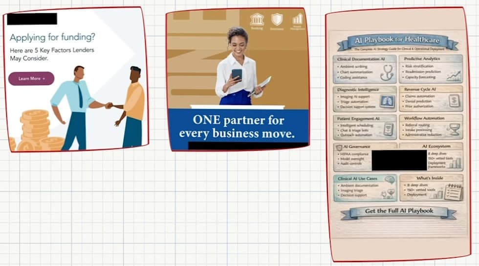
- The lead magnet. “Applying for funding? Here are 5 key factors lenders may consider.” It brings low-intent leads who wanted a list rather than capital, and it needs far more selling on the back end than a direct-response ad does. Alex has never seen anyone run one profitably. It is generic too: illustrated characters that give nobody anything to look at.
- The brand ad. “One partner for every business move.” No number, no product, nothing specific, and nobody clicks on it. Its one merit is that it has a real person in it, and even that cuts both ways, because whatever is in the ad is who comes back as a lead.
- The wall of text. Too many words, cramped, obviously made with AI, and no single product. It is not an MCA ad, but plenty of MCA ads look exactly like it.
The pattern across all six is the creative checklist. The good ads carry three or four of its five ticks and none of its crosses, and the bad ones carry none of the ticks. It is also why copying the ads the big lenders run tends to land in the bad column: their creative works for reasons a new account does not have.